In order to fulfil Assesment Objectives 2 and 3 I researched music magazines in order to identify their generic charecteristics
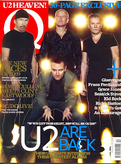
 This magazine is a general music magazine and has therefore not got a niche market. ‘Q’ was first published in 1986 by founders Mark Ellen and David Hepworth. It was originally to be called ‘Cue’ (as in cue the music) but they decided to change the name to ‘Q’ so that viewers did not confuse it with a snooker magazine, they also believed that ‘Q’ is that they believed a single lettered title would be more prominent on magazine stands.
The title of this magazine is ‘Q’. We can see this in the masthead, the name ‘Q’ could have two connotations one of these is that the magazine is giving the audience questions, and answers. Making it seem that the magazine will answer all of your questions. Another connotation of the name ‘Q’ is that it could stand for ‘Q’ the music.
The target audience for this magazine is anyone who has an interest in music, it is aimed at all genders, and the magazine would apply to a more sophisticated person, so the ages that would read this would be older teenagers (16+) and adults, as it had lengthy paragraphs. The magazine will have a mainstream audience as it has diverse bands (the issue I am using which is issue, 271 has: U2, Kid Rock, Grace Jones, John Humphrys and White Lies).
The image on the front cover is of U2 the band consists of four people: Bono (vocal and guitar), The Edge (guitar, keyboard and vocal), Adam Clayton (Bass guitar) and Larry Mullen Jr. (drums and percussion). The person in the foreground is Bono, this is because he is the lead singer, and the most known member of the band, therefore they have placed him in the front to make him stand out more and show his importance to the viewer. Non of the band members are smiling in this photo, this is because they are a rock band. Rock bands have generic elements such as to look aggressive and tough all the time, therefore they don’t smile as that would give connotations of nice music, U2 do not want to be seen as doing nice music, because then there music would not fulfil the purpose they would like it to, or fit into the category of rock music.
Other elements of the photo are the body language of the members, The Edge and Larry Mullen Jr. have their body turned inwards to ward the two band members situated in the middle, this could connote closeness and show that they are all part of the same band. There bodies are straight and there arms are down by there side, this connotes that they are not at ease, as if they were there hands would be in there pockets or in some other position, this could also connote the fact that they are a rough band, because if we look at the facial expression and the body language together, you can tell that they are a rock band. Adam Clayton is stood in the middle with his head raised and his body stiffened straight, this connotes the same thing’s as The Edge and Larry Mullen Jr. We cannot see Adam Clayton’s arm as Bono is bent in front of him blocking the view of his arms. The stance that Bono is in shows the viewer the importance of him to the group. He has his legs spread apart and his back is arched forward and he has his arms apart with his hands open, this could connote that he is letting forth his music again, and passing it to the viewer.
The clothing used is also an element of the image, the three men in the background (The Edge, Adam Clayton and Larry Mullen Jr.) are all wearing black tops and black jeans they all differ in shapes and forms but not in colour, where as Bono has a black top on dark jeans and a green jacket on, this is to once again show importance of Bono.
There is anchorage for this image that says ‘if we get this right, 2009 will be ours. U2 are back. Their ultimate interview, their greatest album’ this writing is the biggest heading on the page, as it is showing us what the photo is about.
There is also a large blue print at the top that says “30 page exclusive” this connotes that that it is a one of special which will make people more willing to buy the magazine. There are also three subheadings that explain what else you can find in this magazine they are in bold gold writing to make them stand out.
Down the side of the magazine is a list of artists that will be featured in the magazine, this is done so that if the viewer does not like the band in the main photo, they will see that there maybe some other bands they will like.
The colours used are gold, black, red, white and blue these colours are neutral and can apply to both male and females, this is why these colours have been chosen, therefore the magazine will have a larger target audience.
The front cover addresses its readers in a fluctuating mode of address, this means that it will switch its mode of address, and could use all three.


